 |
| Good: This is a good typography for a New York City bar. The font is very basic - its not too classy that it would turn away average folk, but its not too casual that it would draw the bridge and tunnel crows. Its a good, solid font to attract a younger, hip crowd. It's easy to read, which is important for people who are looking to drink. The letters are in all capitals, and they are glowing neon red. This is sure to stick out against surrounding stores and to attract wild people looking to have a good time. |
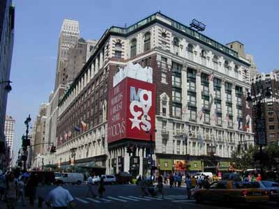 |
| Good: I think that Macy's has picked a great typography for many reasons. Firs tof all, the only thing I really can make out in this pictures is their obvious, blaring red sign. Normally I wouldn't like that the letters are arranged so that theyre overlapping and on top of each other, but it works here because it keeps your attention long enough for you to read that it says Macy's. The giant star also makes it interesting to look at. In all the crowds of people and hundreds of stores in Herald Square, Macys doesnt need to try too hard considering it's by far the largest store in the area. However it makes sure to stand out of the crowd with its giant, bold advertising. |
 |
| Bad: I picked a random street in chinatown to show how the typography is all similar, busy, and frustrating to look at. I thought going somewhere that I wouldn't know the language on the signs would make it obvious which had the best typography - which sign would I be drawn to? But in this area, I found that no particular sign stood out to me, and not just because I don't read chinese. There is an overwhelming selection of signs and it's impossible to pick one that has the best styling choices. For me, the simple signs are better. The signs with the white background and the red writing seem the cleanest and most appealing to me. |
 |
| Bad: Perhaps this font and color scheme may be good for what this place is selling, its not really eye catching or aesthetically pleasing. There are Crown Fried Chicken's all over the city, and even though their food is delicious, it may not always be the best quality. Everything about this typography is average - the font is alright, the dull red and off white, the name that says exactly what they sell, everything. It is easy to read and to the point, which is good for most customers who want to grab food and go. |
 |
| Good: The McDonalds in Times Square may be the flashiest typography I've seen in NYC. All the ads in this part of NY are big and glamarous, but the giant golden arches take the cake. The font is oh so familiar, the shiny gold "M"s are screaming out at you wherever youre standing. The golden arch is a better approach to advertising than writing out the full name; for some reason the sole letter looks less obnoxious than if McDonalds was written out in huge, bright letters. |
 |
| Good: The Apple Store. I guess this isn't technically typography, but it's definitely effective in catching your eye. The apple is bright and bold, and it doesn't need any actual letters to get its meaning across. A giant apple, floating in what seems to be mid-air. |
 |
| Good: This is the Loews Theatre on 68th street. It's my favorite theater, and it follows the typography of pretty much every theater in the city. The font is large and extremely bright with the classis red and yellow lights. I feel like this theater in particular does a good job of making the customer feel like they're really going to get a great show experience. The entrance is grand, the list of movies moves underneath the "Loews" sign, and the words describe exactly what you're going to. A movie theater. |


