Wednesday, October 10, 2012

Helvetica

        Last week in class we watched Gary Hustwit's Helevetica. I didn't think that a movie solely about a font could be as interesting as it was. Even though I have been surrounded by a broad array of typography my entire life, I never thought too intensely about the process of choosing a particular font style. I know the basics aboot appropriate fonts - don't use comic sans for an essay because it makes it look childish, times new roman for anything school or work related, and other simple things like that. I have had to choose a typhography for a media project before, but I don't usually spend too much time on that.
         I loved how the people in the film were so passionate about type face. The one man who said that well constructed fonts got him excited was my favorite - prior to this I wasn't aware that so much work went into making fonts. Since I have always had hundreds of fonts to choose from on a computer, I guess I took it for granted. It was strange to see the modernist and postmodernist view of typefaces. I don't see why some of the people hated helvetica so much, mainly because it was overused or boring or what not. Helvetica is a classic font, and after viewing this documentary, I had a lot of respect for what it's inspired over the past few decades. I didn't fully realize just how many people and companies use Helvetica - I wonder what it is about this font that makes it universally friendly.

Wednesday, September 26, 2012

Typography Response

Typography in the streets of NYC.

Good: This is a good typography for a New York City bar. The font is very basic - its not too classy that it would turn away average folk, but its not too casual that it would draw the bridge and tunnel crows. Its a good, solid font to attract a younger, hip crowd. It's easy to read, which is important for people who are looking to drink. The letters are in all capitals, and they are glowing neon red. This is sure to stick out against surrounding stores and to attract wild people looking to have a good time.


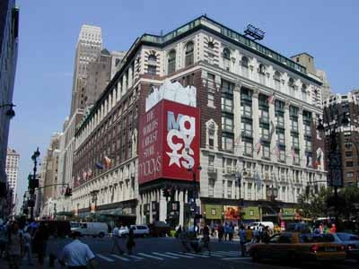
Good: I think that Macy's has picked a great typography for many reasons. Firs tof all, the only thing I really can make out in this pictures is their obvious, blaring red sign. Normally I wouldn't like that the letters are arranged so that theyre overlapping and on top of each other, but it works here because it keeps your attention long enough for you to read that it says Macy's. The giant star also makes it interesting to look at. In all the crowds of people and hundreds of stores in Herald Square, Macys doesnt need to try too hard considering it's by far the largest store in the area. However it makes sure to stand out of the crowd with its giant, bold advertising.

Bad: I picked a random street in chinatown to show how the typography is all similar, busy, and frustrating to look at. I thought going somewhere that I wouldn't know the language on the signs would make it obvious which had the best typography - which sign would I be drawn to? But in this area, I found that no particular sign stood out to me, and not just because I don't read chinese. There is an overwhelming selection of signs and it's impossible to pick one that has the best styling choices. For me, the simple signs are better. The signs with the white background and the red writing seem the cleanest and most appealing to me.

Bad: Perhaps this font and color scheme may be good for what this place is selling, its not really eye catching or aesthetically pleasing. There are Crown Fried Chicken's all over the city, and even though their food is delicious, it may not always be the best quality. Everything about this typography is average - the font is alright, the dull red and off white, the name that says exactly what they sell, everything. It is easy to read and to the point, which is good for most customers who want to grab food and go.


Good: The McDonalds in Times Square may be the flashiest typography I've seen in NYC. All the ads in this part of NY are big and glamarous, but the giant golden arches take the cake. The font is oh so familiar, the shiny gold "M"s are screaming out at you wherever youre standing. The golden arch is a better approach to advertising than writing out the full name; for some reason the sole letter looks less obnoxious than if McDonalds was written out in huge, bright letters.

Good: The Apple Store. I guess this isn't technically typography, but it's definitely effective in catching your eye. The apple is bright and bold, and it doesn't need any actual letters to get its meaning across. A giant apple, floating in what seems to be mid-air.


Good: This is the Loews Theatre on 68th street. It's my favorite theater, and it follows the typography of pretty much every theater in the city. The font is large and extremely bright with the classis red and yellow lights. I feel like this theater in particular does a good job of making the customer feel like they're really going to get a great show experience. The entrance is grand, the list of movies moves underneath the "Loews" sign, and the words describe exactly what you're going to. A movie theater.


Thursday, September 20, 2012

Photo Assignment 9/20/12


This weeks assignment was to find a picture, identify 3-5 shapes, convert them to silhouettes, and then arrange the shapes to convey a particular theme.

Romance


Anger


Busyness

Growth

Loneliness

Serenity


Wednesday, April 18, 2012

Week 8: Mark Fiore

We watched a couple of Fiore's animtions in class, and I liked them because they were a good example of the simple animations we can create in this class. For the most part, the drawings in his animations are still, and there is once character that moves its face (eyes, eyebrows, mouth, etc) and sometimes moves its body a bit. These shorts are mainly for sending a quick message about something relevent in the news, and less about the complicated/extravagant animation. This is just another example of how meaning can come across in a strong way even if the way it is portrayed is not spectacular. Simple effects like a glowing light from a computer monitor give the shorts life and personality.

Week 7: I Met the Walrus

This is one of the cooler text animations I've ever seen. It is fairly simple in the sense that the text and hand-drawn animations match up exactly to what the interviewer/John Lennon is saying. It creates some nice visuals to accompany the statements that John Lennon is making. For example, when John Lennon discusses the idea of trivial v. profound, there is an animation of a Trivial Pursuit Card. This isn't actually relevant to the interview, its just a word translated into a drawing. I love the rotoscope effect - I think it works better with the time period in which the interview was conducted as opposed to a real life recording. There aren't any elaborate colors or really complicated drawings, but I think it is more effective this way. Simple and to the point.

Week 6: Creep - Low Morale

This animation is a very interesting take on Radiohead's Creep.The main character is a simple, thumb-shaped man who stands in one spot for most of the music video. As he sings, the environment around him constantly changes to reflect his meaning of the lyrics. In class we learned that this animation is composed of hundreds of individual drawings that are all compiled into one frame. I think this works well because it gives the viewer the opportunity to watch the environment unfold and transform, and since the character isn't really moving, he isnt a distraction from his elaborate surroundings.