According to the text, playing is a significant concept that extends beyond biological or psychological means. I’ve never tried to intensely analyze why we play games – we play because we want to escape the real world for a little while. We play games for the same reasons we watch movies and read books. I do agree that we need a solid story/narrative in order to make a game meaningful and worth playing. Sometimes when I think about a game I’m playing, I realize how it’s basically just rules and equations that I need to carefully follow to win. If there wasn’t an interesting story behind the game, what would be the point of playing it? I remember the first time I really thought about what I was doing – I was playing Super Mario World for the Super Nintendo, and I was on a level where I had to make Mario fly for an extended period of time to collect coins. If I let him drop too far, he would miss the coins and I would have to run backwards and start again. I was really determined to get the coins, but in the end what was I actually accomplishing? I was trying to make one object hit other objects by pressing a complex set of buttons. The only reason I was doing it was to gain coins (in other words, the story gave motivation to complete the task).
This is why games like snake, in their most basic form, cannot hold our attention for more than a brief amount of time. The motion of directing the snake gets repetitive, and we lose sight of the goal. Playing is meaningful, though I don’t believe it necessarily has to have a meaning to be playing. I can try to throw a crumpled piece of paper into a garbage pail just for the sake of doing it. I am still “playing” even if there isn’t real meaning by it. Or maybe it only counts as playing if I imagine I am shooting a basketball. Perhaps I will have to wait until further readings to fully determine whether or not playing is always meaningful.
Sunday, April 7, 2013

Friday, December 14, 2012
Logo Assignment
When creating these logos, I was having a lot of difficulty making them aesthetically pleasing while also representing something iconic about the person (or idea). After a bunch of failed attempts I decided that in most cases the phrase "less is more" can be applied to a logo. I ended up taking recognizable features/artwork and tweaking them to convey a straightforward concept.
Disney + Star Wars

Tim Burton

Albert Einstein
Wednesday, November 28, 2012
Text Assignment
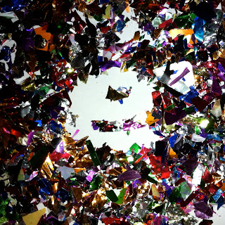
For my assignment I decided to construct the word unnoticed using glitter and confetti. I liked the idea of the contrast between the meaning of the word and the way it was represented. Which is stronger? The written word or the visuals used to portray it?







Thursday, October 18, 2012


Wednesday, October 10, 2012
Helvetica
Last week in class we watched Gary Hustwit's Helevetica. I didn't think that a movie solely about a font could be as interesting as it was. Even though I have been surrounded by a broad array of typography my entire life, I never thought too intensely about the process of choosing a particular font style. I know the basics aboot appropriate fonts - don't use comic sans for an essay because it makes it look childish, times new roman for anything school or work related, and other simple things like that. I have had to choose a typhography for a media project before, but I don't usually spend too much time on that.
I loved how the people in the film were so passionate about type face. The one man who said that well constructed fonts got him excited was my favorite - prior to this I wasn't aware that so much work went into making fonts. Since I have always had hundreds of fonts to choose from on a computer, I guess I took it for granted. It was strange to see the modernist and postmodernist view of typefaces. I don't see why some of the people hated helvetica so much, mainly because it was overused or boring or what not. Helvetica is a classic font, and after viewing this documentary, I had a lot of respect for what it's inspired over the past few decades. I didn't fully realize just how many people and companies use Helvetica - I wonder what it is about this font that makes it universally friendly.
I loved how the people in the film were so passionate about type face. The one man who said that well constructed fonts got him excited was my favorite - prior to this I wasn't aware that so much work went into making fonts. Since I have always had hundreds of fonts to choose from on a computer, I guess I took it for granted. It was strange to see the modernist and postmodernist view of typefaces. I don't see why some of the people hated helvetica so much, mainly because it was overused or boring or what not. Helvetica is a classic font, and after viewing this documentary, I had a lot of respect for what it's inspired over the past few decades. I didn't fully realize just how many people and companies use Helvetica - I wonder what it is about this font that makes it universally friendly.
Wednesday, September 26, 2012
Typography Response
Typography in the streets of NYC.
 |
| Good: This is a good typography for a New York City bar. The font is very basic - its not too classy that it would turn away average folk, but its not too casual that it would draw the bridge and tunnel crows. Its a good, solid font to attract a younger, hip crowd. It's easy to read, which is important for people who are looking to drink. The letters are in all capitals, and they are glowing neon red. This is sure to stick out against surrounding stores and to attract wild people looking to have a good time. |
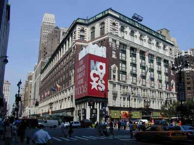 |
| Good: I think that Macy's has picked a great typography for many reasons. Firs tof all, the only thing I really can make out in this pictures is their obvious, blaring red sign. Normally I wouldn't like that the letters are arranged so that theyre overlapping and on top of each other, but it works here because it keeps your attention long enough for you to read that it says Macy's. The giant star also makes it interesting to look at. In all the crowds of people and hundreds of stores in Herald Square, Macys doesnt need to try too hard considering it's by far the largest store in the area. However it makes sure to stand out of the crowd with its giant, bold advertising. |
 |
| Bad: I picked a random street in chinatown to show how the typography is all similar, busy, and frustrating to look at. I thought going somewhere that I wouldn't know the language on the signs would make it obvious which had the best typography - which sign would I be drawn to? But in this area, I found that no particular sign stood out to me, and not just because I don't read chinese. There is an overwhelming selection of signs and it's impossible to pick one that has the best styling choices. For me, the simple signs are better. The signs with the white background and the red writing seem the cleanest and most appealing to me. |
 |
| Bad: Perhaps this font and color scheme may be good for what this place is selling, its not really eye catching or aesthetically pleasing. There are Crown Fried Chicken's all over the city, and even though their food is delicious, it may not always be the best quality. Everything about this typography is average - the font is alright, the dull red and off white, the name that says exactly what they sell, everything. It is easy to read and to the point, which is good for most customers who want to grab food and go. |
 |
| Good: The McDonalds in Times Square may be the flashiest typography I've seen in NYC. All the ads in this part of NY are big and glamarous, but the giant golden arches take the cake. The font is oh so familiar, the shiny gold "M"s are screaming out at you wherever youre standing. The golden arch is a better approach to advertising than writing out the full name; for some reason the sole letter looks less obnoxious than if McDonalds was written out in huge, bright letters. |
 |
| Good: The Apple Store. I guess this isn't technically typography, but it's definitely effective in catching your eye. The apple is bright and bold, and it doesn't need any actual letters to get its meaning across. A giant apple, floating in what seems to be mid-air. |
 |
| Good: This is the Loews Theatre on 68th street. It's my favorite theater, and it follows the typography of pretty much every theater in the city. The font is large and extremely bright with the classis red and yellow lights. I feel like this theater in particular does a good job of making the customer feel like they're really going to get a great show experience. The entrance is grand, the list of movies moves underneath the "Loews" sign, and the words describe exactly what you're going to. A movie theater. |
Thursday, September 20, 2012
Photo Assignment 9/20/12
This weeks assignment was to find a picture, identify 3-5 shapes, convert them to silhouettes, and then arrange the shapes to convey a particular theme.
 |
| Romance |
 |
| Anger |
 |
| Busyness |
 |
| Growth |
 |
| Loneliness |
 |
| Serenity |
Subscribe to:
Posts (Atom)