Monday, June 3, 2013

Sunday, April 7, 2013
Midterm Game Design Reflection
The midterm project was an amazing insight into the process of
creating a playable game. It was much harder to successfully incorporate
everything we’ve learned this semester into the game; between a narrative,
rules, conflict, environment, and more, my group really had to focus to make
the game work. We decided early on that we would want to use the subway map as
a board, but it took us a while to figure out a storyline that would fit with
the board. After throwing ideas back and forth, we finally decided to have an
assassination game where the first player to reach 42nd street would
win the game. To make game play easy to understand, we assigned the boroughs as
players. Each player was either Brooklyn, Queens, Staten Island, or the Bronx,
and everyone had to make it to midtown Manhattan to win the game. We edited the
subway lines to that each player would follow 1-2 subway lines to get to 42nd
street.
Looking back now, I think it would have been better to just eliminate
all the lines except for the ones we would use to play. By keeping the entire
subway map intact, it was a little confusing as to where a player should move
next. I think our system of rules was fairly well thought out. Players would
roll a die to determine how many subway stops they went, and they could land on
express stops or event stops. This made the typical game last for about 15
minutes, which is the targeted time we were looking for. At first we had 20
stops per player, but after playtesting we realized we should make it closer to
30.
Even though each player starts in a different borough, there are
26 stops for each subway thay they use. This ensures an equal playing field, so
whatever borough you are doesn’t affect your change of winning. I made a key
for the game using the actual MTA key, and I edited it to make personal to our
game.

This legend was my favorite part of making the game. Duncan and Gregory took care of the rules and the event cards and I took care of the visuals. Overall our group worked well together and we were all able to compromise and create an interesting game with a solid narrative and a working set of rules.
Rules of Play Response #5: Narratives
In my opinion, narrative play is one of the most vital
components of an enjoyable gaming experience. A narrative gives meaning to the
game we are playing. I tend to prefer games that have a story-mode over games
like checkers or tic-tac-toe, which do not require your character or your
movements to have meaning. Games like this are just performance games, and we
don’t need to have any motive except finishing the game. In order to establish
a system for meaningful play, there are 3 elements that we must have:
situation, character, and form.
Situation: a narrative has an initial state, a change in that
state, and insight brought about by that change. These can be summed up as
events.
Character: A narrative is a personification of events through a
medium.
Form: Representation is constituted by patterning and
repetition.
If we
have these 3 components, we have a narrative in game play. Giving a story to a
game is probably the only reason why we like to play games. Lets say the goal
of a certain level was to collect 10 stars. Without a character or an
environment, we would be a digital figure wandering around a coded environment
searching for a specific item. Why would we put ourselves through this? If we
turn ourselves into Mario and we need 10 stars to gain access to a new level,
the goal suddenly becomes much more interesting and meaningful.
Uncertainty
is another important aspect of meaningful game play. Why would we watch a movie
if we knew exactly what was going to happen? Why would we read a book if the
ending was entirely obvious? The same mindset exists when playing a game. There
needs to be some mystery in it for us to be dedicated enough to finishing the
game. Even if we know the goal of a game, the way in which we achieve that goal
isn’t always obvious. We have to use trial and error to figure out how to beat
it, giving uncertainty to the game.
Rules of Play Response #4: Rules of Digital Games
In order to analyze the rules of digital games, we must first
establish what defines a rule: they limit player action, they are explicit and
unambiguous, all players share them, they are fixed, they are binding, and they
are repeatable. When moved to a computer or a gaming console, it is necessary
that these rules be translated into the game. By playing an electronic game, we
are really changing the way the game is being played. Not the rules – just the
method of play. For example, playing tic-tac-toe changes when we do it on a
computer because now we have an aspect of a screen, a mouse, and clicking.
Instead of paper and pencil, we must learn to use the tools that the computer
allows us to play the game. The rules of the game remain unchanged, but we must
adapt to the digital version.
This
reading also dealt with conflict. If you think about it, there is pretty much
always a conflict in a game; that’s why we play it! We want to resolve the
conflict by performing certain tasks. The challenges we face in a game are the
conflict. Sometimes the conflict is as simple as beating your opponent in a
game of chance. Sports often take on the group v group conflict, with teams
working together to try and come out on top. There is also one against many,
single player competing against a game system, a group competing against a game
system, or every man for themselves. Resolving conflicts is often driven by
competition.
Another
major component in conflict is the goal of a game. In one game there can be
many different conflicts. When we look at the game Tetris, we know that it is always the goal to try and clear the
level by trying to complete lines. However there are different modes of play in
Tetris. We can play to clear the board, we can play until we clear 40 lines, or
we can see how many lines we can clear in a certain amount of time. These all
fall under the game of Tetris, but the conflict in each of these versions
differ from one another.
Choose a Sport! Sumo


·
Components
- Two Sumo wrestlers, a dohyo (a ring measuring 14.9 ft in areaand 175 sq feet in area. There are rice-straw bales in top of the platform thatare composed of clay and sand. Many of these also have Shinto Shrine as a roof, since sumo isvery traditional.
· Rules
- The Sumo Association makes upthe rules. Sumo is not just a sport, but also a lifestyle, where sumo wrestlershave distinct communities (heya) with a very strict schedule. Their clothing,diet, and behavior is determined by the life of the Sumo.
· Goals
- The goal of the game is to knock your opponent out of the ring or off of hisfeet. You can slap, grab, grab, and push your opponent to get them out of the ring.
- The goal of the game is to knock your opponent out of the ring or off of hisfeet. You can slap, grab, grab, and push your opponent to get them out of the ring.
· Core Mechanics
- In sumo, core mechanics arevisible in the approaches that each sumo wrestler takes to knock the other onedown. There are certain strategies and techniques that players use which can bepredicted if the palayer repeats a certain pattern too often.
· Game Space
- dohyo (a ring measuring 14.9 ft in area and 175 sq feet in area. There are rice-straw bales in top of the platform that are composed of clay and sand. Many of these also have Shinto Shrine as a roof, since sumo is very traditional.
- dohyo (a ring measuring 14.9 ft in area and 175 sq feet in area. There are rice-straw bales in top of the platform that are composed of clay and sand. Many of these also have Shinto Shrine as a roof, since sumo is very traditional.
· Choice
· Conflict
– Sumo is a very aggressive sport. It is a contact sport. The conflict is to beat your opponent! Knock him down!
Rules of Play Response #3: Defining Rules
This reading was a bit
more straightforward than the previous ones. Whenever I am asked if I want to
play a game that I haven’t heard of before, there is only one question that
comes to mind: what are the rules? There
is simply no way to properly participate in a game if you aren’t aware of what
limitations you have. The rules are probably the most defining characteristic
of a game – they give you your goal, and they tell you how you are meant to
achieve it. By examining a deck of cards and all the games that use one, it is
explained how the pieces/parts of a game are engrained into the rules. There
are also rules of strategy, which aren’t required but are vital to win the
game. The example they use is when playing tic-tac-toe, it is a strategic rule
to block your opponent from making 3 in a row.
Many
games share general rules, or “under the hood rules.” Rules such as players alternate turns. These types of
rules must exist within context of the rest of the game in order to make sense.
This example doesn’t tell you how to make a turn, it just lets you know that
players will take turns one after the other.
My
favorite part of the reading was how it pointed out that science is considered
a form of uncovering rules of nature. The more we learn about the world, the
more we are able to understand the relationships between molecules. I never
tried to pt science so simply; if we can figure out the rules of nature, we can
better play the game of life.
Rules of Play Response #2: Systems
This reading introduces us to gaming systems
by using examples such as the human body, organs, and the skeletal system to
illustrate how they work. A gaming system must have an organized set of rules
and principles, and a general form that is common throughout the game. This is
what makes the game make sense and what make’s it playable. I was a bit
confused as to what the book meant, however once they used soccer as an example
the concept became much clearer to me. In order for a system to work, every
component of that particular system must be doing it’s part. How can a soccer
team expect to win without a goalie? Without offensive players? Each player has
a task, and each task must be performed in order to win. A system isn’t just
the characters and the goal, but it is also the setting. For a game to be
played, there must be a game space that fits the needs of the game itself. So
we must remember that a gaming system encompasses objects,
attributes, internal relationships, and environment.
I
feel that there must be a correlation between complexity of gaming systems and
the dedication a person has to finishing them. As I said in my last post, games
such as snake have
an extremely simple system: there is a snake, there are the dots the snake must
eat, and the only rule is that you can’t run into yourself or the wall. The
system is basic, and my attention span for the game is limited. However, I am
much more intrigued when I play old Pokémon games on my GBA. There is so much
potential in the game, hundreds of Pokémon, numerous trainers, various
minigames, and more. The structure of the game is complex and I find that I am
more curious to try and progress in the game. This may also have something to
do with interactivity;
I have taken on the role as my virtual trainer and created relationships within
the game. For the most part my path to becoming a Pokémon leader is set in the
game structure, but I do have the freedom to choose to do activities on the
side as well.
Game Design Challenge 1: The Great Retainer
Game includes, 8 cups and a bag of multicolored bouncy balls.
Game is intended for 4+ players on teams. To be played on any table available, please make sure it is level! :D
Rules of Great Retainer:
1- Each team picks and end of the table to set up their cups. You will have 4 cups each. One cup is intended to hold the bouncy balls, aka holding cup. (Note: 3 of the 4 cups are numbered, what for? POINTS!!)
2- Divide the balls evenly between the teams and place your bouncy balls in the holding cup. Different colored balls represent different amounts of time, you have a given amount of time designated by the ball’s color to get them in a cup. (Example: red = 10 second, blue = 15 seconds, etc.)
3- When players are ready one player from each team throws a ball towards their opponents cup to see which team will start. Whomever gets the bouncy ball in a cup first will start.
4- Team players must take turns throwing at the opposing teams cups and only within the given time frame designated by ball color. Anything outside the time frame may count against your team.
5- Game is over when one team has gotten all their bouncy balls in their opposing teams cups.
6- At the end of play count how many balls are in each cup and multiply that by the number on the bottom of the cup.
7- Team with the most points WINS!!!
Credit Logo: Jacob Concept: Jacob, Sabrina, Omali, Esmee. Tittle: Omali**By the time I checked our fb thread my group had pretty much established the concept and title for this game. The only thing I actually did was come up with the tagline!
Rules of Play Response #1: Defining Games
According to the text, playing is a significant concept that extends beyond biological or psychological means. I’ve never tried to intensely analyze why we play games – we play because we want to escape the real world for a little while. We play games for the same reasons we watch movies and read books. I do agree that we need a solid story/narrative in order to make a game meaningful and worth playing. Sometimes when I think about a game I’m playing, I realize how it’s basically just rules and equations that I need to carefully follow to win. If there wasn’t an interesting story behind the game, what would be the point of playing it? I remember the first time I really thought about what I was doing – I was playing Super Mario World for the Super Nintendo, and I was on a level where I had to make Mario fly for an extended period of time to collect coins. If I let him drop too far, he would miss the coins and I would have to run backwards and start again. I was really determined to get the coins, but in the end what was I actually accomplishing? I was trying to make one object hit other objects by pressing a complex set of buttons. The only reason I was doing it was to gain coins (in other words, the story gave motivation to complete the task).
This is why games like snake, in their most basic form, cannot hold our attention for more than a brief amount of time. The motion of directing the snake gets repetitive, and we lose sight of the goal. Playing is meaningful, though I don’t believe it necessarily has to have a meaning to be playing. I can try to throw a crumpled piece of paper into a garbage pail just for the sake of doing it. I am still “playing” even if there isn’t real meaning by it. Or maybe it only counts as playing if I imagine I am shooting a basketball. Perhaps I will have to wait until further readings to fully determine whether or not playing is always meaningful.
This is why games like snake, in their most basic form, cannot hold our attention for more than a brief amount of time. The motion of directing the snake gets repetitive, and we lose sight of the goal. Playing is meaningful, though I don’t believe it necessarily has to have a meaning to be playing. I can try to throw a crumpled piece of paper into a garbage pail just for the sake of doing it. I am still “playing” even if there isn’t real meaning by it. Or maybe it only counts as playing if I imagine I am shooting a basketball. Perhaps I will have to wait until further readings to fully determine whether or not playing is always meaningful.
Friday, December 14, 2012
Logo Assignment
When creating these logos, I was having a lot of difficulty making them aesthetically pleasing while also representing something iconic about the person (or idea). After a bunch of failed attempts I decided that in most cases the phrase "less is more" can be applied to a logo. I ended up taking recognizable features/artwork and tweaking them to convey a straightforward concept.
Disney + Star Wars

Tim Burton

Albert Einstein
Wednesday, November 28, 2012
Text Assignment
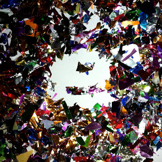
For my assignment I decided to construct the word unnoticed using glitter and confetti. I liked the idea of the contrast between the meaning of the word and the way it was represented. Which is stronger? The written word or the visuals used to portray it?







Thursday, October 18, 2012


Wednesday, October 10, 2012
Helvetica
Last week in class we watched Gary Hustwit's Helevetica. I didn't think that a movie solely about a font could be as interesting as it was. Even though I have been surrounded by a broad array of typography my entire life, I never thought too intensely about the process of choosing a particular font style. I know the basics aboot appropriate fonts - don't use comic sans for an essay because it makes it look childish, times new roman for anything school or work related, and other simple things like that. I have had to choose a typhography for a media project before, but I don't usually spend too much time on that.
I loved how the people in the film were so passionate about type face. The one man who said that well constructed fonts got him excited was my favorite - prior to this I wasn't aware that so much work went into making fonts. Since I have always had hundreds of fonts to choose from on a computer, I guess I took it for granted. It was strange to see the modernist and postmodernist view of typefaces. I don't see why some of the people hated helvetica so much, mainly because it was overused or boring or what not. Helvetica is a classic font, and after viewing this documentary, I had a lot of respect for what it's inspired over the past few decades. I didn't fully realize just how many people and companies use Helvetica - I wonder what it is about this font that makes it universally friendly.
I loved how the people in the film were so passionate about type face. The one man who said that well constructed fonts got him excited was my favorite - prior to this I wasn't aware that so much work went into making fonts. Since I have always had hundreds of fonts to choose from on a computer, I guess I took it for granted. It was strange to see the modernist and postmodernist view of typefaces. I don't see why some of the people hated helvetica so much, mainly because it was overused or boring or what not. Helvetica is a classic font, and after viewing this documentary, I had a lot of respect for what it's inspired over the past few decades. I didn't fully realize just how many people and companies use Helvetica - I wonder what it is about this font that makes it universally friendly.
Wednesday, September 26, 2012
Typography Response
Typography in the streets of NYC.
 |
| Good: This is a good typography for a New York City bar. The font is very basic - its not too classy that it would turn away average folk, but its not too casual that it would draw the bridge and tunnel crows. Its a good, solid font to attract a younger, hip crowd. It's easy to read, which is important for people who are looking to drink. The letters are in all capitals, and they are glowing neon red. This is sure to stick out against surrounding stores and to attract wild people looking to have a good time. |
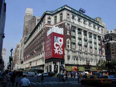 |
| Good: I think that Macy's has picked a great typography for many reasons. Firs tof all, the only thing I really can make out in this pictures is their obvious, blaring red sign. Normally I wouldn't like that the letters are arranged so that theyre overlapping and on top of each other, but it works here because it keeps your attention long enough for you to read that it says Macy's. The giant star also makes it interesting to look at. In all the crowds of people and hundreds of stores in Herald Square, Macys doesnt need to try too hard considering it's by far the largest store in the area. However it makes sure to stand out of the crowd with its giant, bold advertising. |
 |
| Bad: I picked a random street in chinatown to show how the typography is all similar, busy, and frustrating to look at. I thought going somewhere that I wouldn't know the language on the signs would make it obvious which had the best typography - which sign would I be drawn to? But in this area, I found that no particular sign stood out to me, and not just because I don't read chinese. There is an overwhelming selection of signs and it's impossible to pick one that has the best styling choices. For me, the simple signs are better. The signs with the white background and the red writing seem the cleanest and most appealing to me. |
 |
| Bad: Perhaps this font and color scheme may be good for what this place is selling, its not really eye catching or aesthetically pleasing. There are Crown Fried Chicken's all over the city, and even though their food is delicious, it may not always be the best quality. Everything about this typography is average - the font is alright, the dull red and off white, the name that says exactly what they sell, everything. It is easy to read and to the point, which is good for most customers who want to grab food and go. |
 |
| Good: The McDonalds in Times Square may be the flashiest typography I've seen in NYC. All the ads in this part of NY are big and glamarous, but the giant golden arches take the cake. The font is oh so familiar, the shiny gold "M"s are screaming out at you wherever youre standing. The golden arch is a better approach to advertising than writing out the full name; for some reason the sole letter looks less obnoxious than if McDonalds was written out in huge, bright letters. |
 |
| Good: The Apple Store. I guess this isn't technically typography, but it's definitely effective in catching your eye. The apple is bright and bold, and it doesn't need any actual letters to get its meaning across. A giant apple, floating in what seems to be mid-air. |
 |
| Good: This is the Loews Theatre on 68th street. It's my favorite theater, and it follows the typography of pretty much every theater in the city. The font is large and extremely bright with the classis red and yellow lights. I feel like this theater in particular does a good job of making the customer feel like they're really going to get a great show experience. The entrance is grand, the list of movies moves underneath the "Loews" sign, and the words describe exactly what you're going to. A movie theater. |
Thursday, September 20, 2012
Photo Assignment 9/20/12
This weeks assignment was to find a picture, identify 3-5 shapes, convert them to silhouettes, and then arrange the shapes to convey a particular theme.
 |
| Romance |
 |
| Anger |
 |
| Busyness |
 |
| Growth |
 |
| Loneliness |
 |
| Serenity |
Wednesday, April 18, 2012
Week 8: Mark Fiore
We watched a couple of Fiore's animtions in class, and I liked them because they were a good example of the simple animations we can create in this class. For the most part, the drawings in his animations are still, and there is once character that moves its face (eyes, eyebrows, mouth, etc) and sometimes moves its body a bit. These shorts are mainly for sending a quick message about something relevent in the news, and less about the complicated/extravagant animation. This is just another example of how meaning can come across in a strong way even if the way it is portrayed is not spectacular. Simple effects like a glowing light from a computer monitor give the shorts life and personality.
Week 7: I Met the Walrus
This is one of the cooler text animations I've ever seen. It is fairly simple in the sense that the text and hand-drawn animations match up exactly to what the interviewer/John Lennon is saying. It creates some nice visuals to accompany the statements that John Lennon is making. For example, when John Lennon discusses the idea of trivial v. profound, there is an animation of a Trivial Pursuit Card. This isn't actually relevant to the interview, its just a word translated into a drawing. I love the rotoscope effect - I think it works better with the time period in which the interview was conducted as opposed to a real life recording. There aren't any elaborate colors or really complicated drawings, but I think it is more effective this way. Simple and to the point.
Week 6: Creep - Low Morale
This animation is a very interesting take on Radiohead's Creep.The main character is a simple, thumb-shaped man who stands in one spot for most of the music video. As he sings, the environment around him constantly changes to reflect his meaning of the lyrics. In class we learned that this animation is composed of hundreds of individual drawings that are all compiled into one frame. I think this works well because it gives the viewer the opportunity to watch the environment unfold and transform, and since the character isn't really moving, he isnt a distraction from his elaborate surroundings.
Week 5: Jan Svankmajer - tma/svetlo/tma (Darkness/Light/Darkness)
I think this may be my favorite piece that I have watched so far. The entire stop-motion animation takes place in a small, empty room, and different body parts enter the room one at a time. It starts off with just one hand and two eyeballs, and then another hand, a pair of ears, and so on. The body parts rearrange themselves as each new one enters the room, and it gives the viewer a fun way to see how body parts would work if they were put together differently. There is a real struggle to get the bigger body parts (such as the head) in the room, and I like how each limb reacts in a unique way. The limbs and organs have a distinct personality, and when two or more parts join together, they turn into one united being. The development of the body and the pace of the animation are perfectly timed, and the lights being turned out after there is a whole body is a nice touch. Almost like the work that needed to be done is done, and its time for the man to rest peacefully.
Week 4: Stan Vanderbeek - Science Friction
Science Friction is a cut-out animation that I feel is ahead of its 1959 production date. The animation is very complex and jumps from image to image rather quickly. It is a good representation and criticism of the American conformist culture that was present around the Cold War. The music is fast paced to compliment the rapid movement of the animation. I really like the way Vanderbeek combines different images (such as a dogs head on a human body), and he is extremely successful at keeping the viewers attention. The combination of real life film, cut-out art and hand drawn animation work together better than I could have ever thought possible.
Subscribe to:
Posts (Atom)